“All models are wrong but some are useful.”
George E. P. Box, British statistician, from his 1979 paper on scientific model building
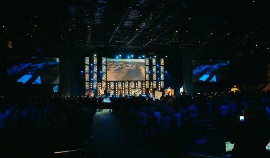
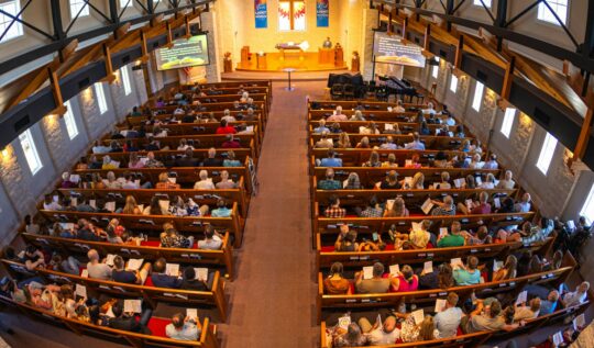
On dedication Sunday, the people who gave the most to the building campaign tend to do the same thing when they walk into the new sanctuary for the first time. They look up. What they see is a ceiling that did not appear in the architectural rendering they were shown three years earlier: two speaker clusters hanging from the structure, a truss full of stage lights, round supply diffusers in a neat grid, sprinkler heads, a projector mount, and glowing red exit signs over every door. The room is good, often better than they hoped, and nothing in it is wrong. But the image they carried in their heads for three years was a clean, soft-lit volume with nothing above the seating but light, and the gap between that picture and the real room is the first thing they notice. That gap is avoidable, and closing it is mostly a matter of knowing what a rendering usually leaves out and asking for the honest version before anyone writes a check.
Two kinds of pictures that look exactly alike
There are, broadly, two kinds of architectural renderings, and from across a lobby they are indistinguishable. The first is illustrative. Its job is to convey the character of a place: the way light falls into the room, the warmth of the materials, the feeling of arriving at the front door. The second is technical. Its job is to show what will actually be built, from a real viewpoint, at true scale, with the elements that will really be there. Both are legitimate, and a building campaign usually needs some of each. The trouble starts when an illustrative image is used to make a decision that only a technical image can support, and nobody in the room realizes that is what is happening.
The clearest written statement of that distinction was not produced in America. It comes from the Landscape Institute, the professional body for landscape architects in the United Kingdom, which published a technical guidance note on visualizing development proposals in September 2019. Visual representation is a side subject for that organization, well down the list from the practice of landscape architecture itself, and they still spent years on it. There was a committee, a public consultation draft in 2018, and more than fifty written responses from practitioners and public authorities. What emerged separates technical visualizations, which accompany planning applications and must be built from specific viewpoints with specific camera settings, from illustrative ones intended for marketing, which it describes as conveying “the essence of what a proposal would look like.” The United States does have rigorous visual standards, but only where a federal agency is doing the reviewing. The Federal Highway Administration publishes guidance for assessing the visual impact of highway projects. The Bureau of Land Management runs a contrast rating system for public lands, and the Forest Service maintains its own scenery management system. Propose a wind farm on federal ground and somebody will scrutinize your photomontage. Propose a sanctuary for twelve hundred people on land your congregation already owns, and the only standard is whatever your architect decides is fair.
The Landscape Institute is not writing about interior renderings or digital twins. Its subject is the view of a proposed development from somewhere in the surrounding landscape, the sort of image argued over when a neighbor claims a building will spoil a ridgeline. Their visualization types run from an annotated photograph of an existing view, through wireline models, to photomontages that composite a three-dimensional model into real site photography. Showing a congregation what the inside of its sanctuary will feel like is a different problem. What carries across is not the method. It is the premise, which is that an image made to inform a decision carries obligations that an image made to inspire does not.
From the research
“It is critical that these visualisations are accurate, objective and unbiased.”
Why an architectural rendering looks better than the building will
The omissions in most renderings are not deceptions. They are a matter of chronology. The images that anchor a capital campaign are usually produced during schematic design, because that is when a congregation or a board needs something to rally around. At that stage, the architect has settled the shape of the building, the major rooms, and the palette of materials, but the mechanical engineer has not yet located a single diffuser, the audio consultant has not hung a speaker, and the fire protection designer has not laid out a sprinkler head. The rendering shows what has been designed so far. Everything that has not been designed yet is simply absent, and absent things look like clean surfaces. We do not spend the time to place every light switch, air vent, exit sign, outlet, access panel, smoke detector, or alarm keypad.
That means the rendering is accurate about the architect’s intentions and silent about everyone else’s. On a church or a hotel ballroom, everyone else’s work is a large share of what a person sees overhead. Every sanctuary needs supply and return air and emergency lighting, most need sprinkler coverage, and larger rooms need fire alarm strobes. The International Building Code requires illuminated exit signs wherever a room needs more than one way out, which includes any assembly room for more than about fifty people. A contemporary worship space adds a sound system, a lighting rig over the platform, cameras, projectors or LED walls, and the cable paths that connect them. None of this is a surprise to the design team. It is only a surprise to the people who formed their picture of the room from an image made before any of it existed.
Here is the part that matters most to an owner. The things a rendering leaves out are usually the things nobody has designed yet. A ceiling that is clean in the rendering can be clean in the building, but only if somebody decides early that the speakers will be coordinated with the structure, that the ductwork will run above an acoustic cloud or be painted to disappear against a dark deck, and that the lighting truss will be integrated rather than bolted on after the fact. Those decisions cost very little when they are made in design development and a great deal when they are made by a subcontractor in the field. Rendering what will really be there is one of the simplest ways to make sure somebody makes them.
The things a rendering leaves out are usually the things nobody has designed yet.
The roof, the back wall, and the service yard
Exterior renderings have their own predictable blind spots, and almost all of them live on the roof and at the back of the building. Most campaign images are drawn from the front, at the moment of arrival, because that is the view people remember. The rooftop units that heat and cool the building are often left off, or hidden behind a parapet that may not be tall enough once the real equipment is selected. The electrical transformer pad, the gas and electric meters, the backflow preventer, the generator if there is one, and the dumpster enclosure all tend to sit along the side or rear elevations that never get rendered, along with the downspouts and the utility service entrance.
For a congregation, the rear of the building is rarely a concern on Sunday morning. For the neighbors, it is often the only side they see. Municipal codes recognize this directly. Hazelwood, Missouri, for instance, requires that accessory structures and mechanical equipment be landscaped around their footprints, which is a planning commission’s way of saying that it knows these things exist even if the pictures do not show them. We have written about what a planning commission needs to see, and the same principle applies to a donor or a building committee. The honest set of images includes at least one view of the building from the side where the services are, so that the screening, the enclosures, and the equipment are designed and priced rather than discovered.
Trees, sky, and an empty parking lot
The landscaping in a rendering is almost always mature, and that may be the single most consistent gap between an image and a ribbon cutting. Renderings show full canopy trees framing the entry and softening the parking lot because that is what the site is designed to become. What gets planted is much smaller. The same Hazelwood code sets a minimum of two and one-half inches of trunk caliper for new canopy trees, a common figure in commercial landscape ordinances and a description of a young tree, not a shade tree. Growth is slow from there. The Missouri Department of Conservation classifies white oak, bur oak, and pecan as slow-growing species that add twelve inches or less a year, and its fast-growing category begins at twenty-four inches a year. A rendering with forty-foot oaks along the drive is a picture of the building in its third decade, and nobody should be surprised when the first summer looks bare.
The sky and the light deserve the same scrutiny. Many exterior renderings are set at golden hour, with low warm sun raking across the facade, because that is when buildings photograph best. A Missouri church will be seen far more often under a flat gray winter sky at nine in the morning, and a material that sings in late sunlight can read as dull in overcast. The parking lot raises a related problem. Renderings tend to show either an empty lot or a handful of tidy cars, while the actual building at a quarter to eleven on Sunday has every space filled, cars circling, and people walking between rows. An image of the site at its real peak is less beautiful, and it is far more useful for judging whether the drop-off, the walks, and the entry canopy are sized correctly.
Then there is the camera, and this is where the British go somewhere the rest of us have not followed. The Landscape Institute guidance treats a 50mm lens on a full-frame camera as the baseline for technical views, because it approximates how people actually see, and it asks for wider lenses only when a view cannot otherwise be captured. The document then proceeds into appendices covering which camera body to use, how to set exposure and white balance, what to record about tripod height and position so that somebody else can audit the image later, how to photograph a site at night, and how to build a panorama that does not distort what a person would really perceive. One of the companion technical notes is devoted to the curvature of the earth, on the entirely correct grounds that across a long enough view it changes what is genuinely visible. All of this guidance is currently under review, about to be updated, which we can only assume means somebody has concluded it was not yet thorough enough.
For perspective
That same guidance defines four types of visualization, ranked by how far each one can be independently checked. The most rigorous requires surveyed camera positions, so that a skeptic can stand in the same spot, hold up the image, and compare it to the building. We think hard about renderings at UNITE. We do not think about them the way a committee in London thinks about them, and no standard anywhere in American practice asks us to for the kind of building most of our clients are putting up.
Asking for the honest version
None of this is an argument against beautiful images. People give to what they can picture, and nobody needs a campaign brochure full of rooftop units. The risk is not in the beauty. It is in the gap between what people were shown and what they receive, because for a church or a nonprofit, the next campaign depends on whether donors felt the last one told them the truth.
The practical answer is to ask for both kinds of images and to know which is which. We recommend that owners request, at a minimum, an eye-level view of the main entry and the main room taken with a normal lens, a view of the side or rear where the services and equipment sit, and a version of the site with landscaping shown at planting size alongside the mature version. Once the engineers and the audio and lighting designers have placed their systems, usually in design development, the key interior views should be updated to include the ceiling as it will really be.
Worth knowing
A good set of campaign images labels each one as either an artist’s illustration or a design-accurate view, states the design phase and date it reflects, and is updated once the engineers have placed their systems. Those three habits prevent most of the disappointment people associate with renderings.
The cost of working this way is modest. A few additional views and one round of updates are a small fraction of a visualization budget, and far cheaper than a ceiling redesigned in the field, a parapet raised during construction because the rooftop units turned out to be visible from the street, or a congregation that quietly concludes the building was oversold. The honest images also drive better design. When a building committee sees the real ceiling in a rendering, it asks the right question while the answer is still cheap, which is whether that ceiling can look better.
The British wrote their standard because planning inquiries forced them to. When a development is argued over in public and an image is the evidence, somebody has to decide what makes that image trustworthy, and the answer cannot be a matter of taste. An owner building a church has no such document standing behind them, so the discipline has to come from the request instead. Asking which kind of image this is, and what was simplified in order to make it, does most of the work that a hundred pages of appendices do.
Box’s point about models was that none of them is perfect, so the only question worth asking is whether you know where a model is wrong and whether it stays useful once you do. A rendering is a model of a building that does not exist yet. Used with an understanding of what it simplifies, it is one of the most powerful tools an owner has. Used without that understanding, it sets an expectation the building was never going to meet.
At UNITE, our visualization team and our architects work as one group, so the images we produce are built from the same model the drawings come from rather than painted alongside it. That lets us say plainly which views are illustrative and which are design-accurate, and update the key images as the engineering is resolved, which catches the ceiling, rooftop, and site issues while they are still design decisions instead of field changes. We are not going to survey a camera position for you, and we are not going to calculate the curvature of the earth. After more than a thousand church projects, what we can do is tell you which surprises tend to appear on dedication Sunday, and show them to you in a rendering three years earlier. You can see more about how we approach architectural visualization, and if you are preparing for a campaign or a building committee review, we would be glad to talk about which images will serve you best.
Let’s Talk About Your Project
Every project starts with a conversation. If you have something in mind, or just a question, reach out and we will get back to you within one business day.